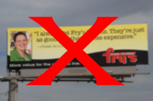
 Living in Los Angeles, you can’t avoid lengthy commutes, and with lengthy commutes comes lots of opportunities to see billboards. Oh, we’ve got lots of ‘em…of all sizes…pitching everything from auto lube centers to Hollywood blockbusters. Yes, even funeral homes and law firms use this tried-and-true medium, which as it turns out, is a great vehicle (no pun intended) for local advertising. After all, done right, billboards can stand out. If you’re stuck in traffic, you’re a captive audience. They’re a great “reminder” medium supporting other marketing efforts. And they can be located strategically, even across the street from a competitor!
Outdoor advertising, which includes billboards, bus benches, bus sides, bus shelters, subway panels and even entire sides of buildings, can be hugely effective if the creative is done correctly. That’s the rub, because there’s a whole lot of outdoor that just sucks and the marketers don’t even know it. Their messages are practically invisible, even if positioned at the best intersections of the city.
Yet doing it right isn’t all that difficult as long as one follows some basic guidelines. Here are a few pointers that can lead to much more effective outdoor advertising.
Interestingly, the same pointers also apply to just about any medium that is either small or a quick read, such as online banners, yellow page ads or tee-shirts.
To start with, respect the medium. It’s only big when you’re standing right next to it. But in your car, it’s barely the size of your own thumb when you hold your hand at arm’s length. And at 45 – 65 miles per hour, it’s only in view for about 5 seconds!
So a good way to test your billboard is to print it out on a sheet of paper and stand far enough back so your thumb can block it out. Then look at it for 5 seconds. If you can’t read the message for that tiny amount of time, redesign the artwork so you can. That’s your litmus test.
Focus on one single, simple message. Don’t make the viewer have to work for it. Have one thing you want to say, say it well, say it quickly and say it simply. And the same goes with any photo or artwork. If someone has to figure out the picture in the few seconds they have, it will be a lost cause.
At the same time, don’t bury your product or brand. When all’s said and done, people must know who or what is being advertised. I see plenty of boards that only after I’ve driven past them a number of times do I know who’s the sponsor. If your brand isn’t Coke or Target or MacDonald’s, make the logo or product a major element.
And finally, billboards are a great reminder medium. They’re a great branding medium. But unless you have a really simple vanity phone number or super-simple and memorable URL, don’t rely on your billboards to generate immediate action if someone has to write down a number or website while driving.
In the end, the old K I S S rule applies – keep it simple. But also, don’t forget to make it powerful too.
####
Dan Katz is president, creative director of LA ads. To discuss your thoughts with Dan on this blog or any marketing matters, email via this link, or visit www.LAadsMarketing.com. You can also connect with Dan on LinkedIn. See agency work via this link.